

Friday, February 22, 2008
Whadda think?
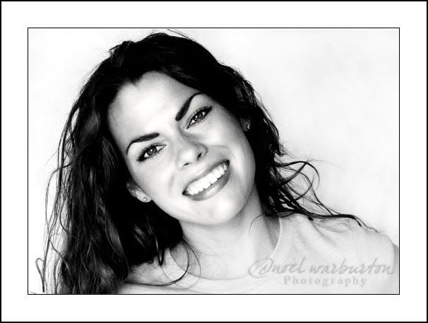
So my logo has been bugging me lately. Nothing real wrong with it, it's just kinda blah. So I spent about and hour today and came up with this. Any thoughts? Anything that bugs you or you think might look better? I was practicing some sun flare outside the other day, so that's what the picture comes from. Oh, I've noticed I'm such a good blogger lately, huh?! :) (if you click on the picture you can see it bigger)

Subscribe to:
Post Comments (Atom)
4 comments:
Love the picture. I think the logo is fine when you see the name attached to it, but at first glance it looks like womanly anatomy (either top or backside).
OMGOsh! Tara that is too funny! Since I only thought of it as a W, I would have never seen that. I laughed so hard. Yeah, the name would probably always have to be attached.
ohh now that she said that that is all I can think about! it does kinda look like boobies hehehe! I like the color and the font of your name though.
i love that whimsy of it and "freeness" of it. i don't love how small the "n" is compared to the "w". oh, and the website is lovely! simply lovely.
Post a Comment